
Grow-ceries: Grocery shopping and meal planning solution
Product Designer | 16 Weeks
Overview
A mobile application aimed to help users with dietary restrictions grocery shop, meal prep, and
maintain a balanced diet efficiently!
The Problem
College students want to save money by grocery shopping.As a college student struggling to maintain a balanced diet while keeping a hectic and unpredictable schedule, it’s hard to remember everything that’s in my fridge and difficult to decide what to make. This problem only gets worse for those with dietary restrictions as they have to take the foods they avoid and particular nutritional substitutions into careful consideration.
My team and I wanted to create a product that would conveniently help busy users with dietary restrictions keep a nutritionally balanced diet.
User Research
What are pain points for our users?We sat down with four students with various dietary restrictions such as nut allergy, vegetarian, and a tropical fruit allergy. From these interviews, we gained the following insights.
Users typically:
- Are conscious of creating a balanced diet, though they do not all act on it.
- Prioritize cost and convenience when preparing meals/eating.
- Do not plan out their meals a long time in advance.
Product Requirements
What do our users need in the product?From these insights, we were able to pull out the following product requirements:
- Take into account the user’s specific restriction, only avoiding foods that the student cannot or does not want to eat and factor in multiple dietary restrictions if necessary.
- Track what foods the user current has in their kitchen.
- Recommend meal options based on what ingredients the user has at hand.
- Identify foods that do not fit within a user’s diet (allergens).
User Testing
How is our design aligning with user needs?The team met with four different users with an established list of tasks and scenarios that would run through all the flows of the original iteration.
Metrics for testing:
- Learnability
- Efficiency (User vs Happy Path click rate)
- Error rate
- Fit into user lifestyle
From testing, we were able to identify the following problem areas:
- Many users were confused by the home page display of nutritional information.
- They wanted clarity on the nav bar icons.
- They also struggled to understand the search bar within the recipe page.
Final Flows
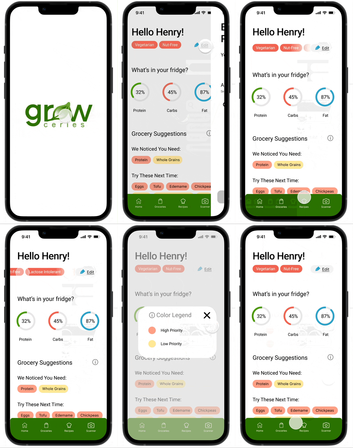
Home Page
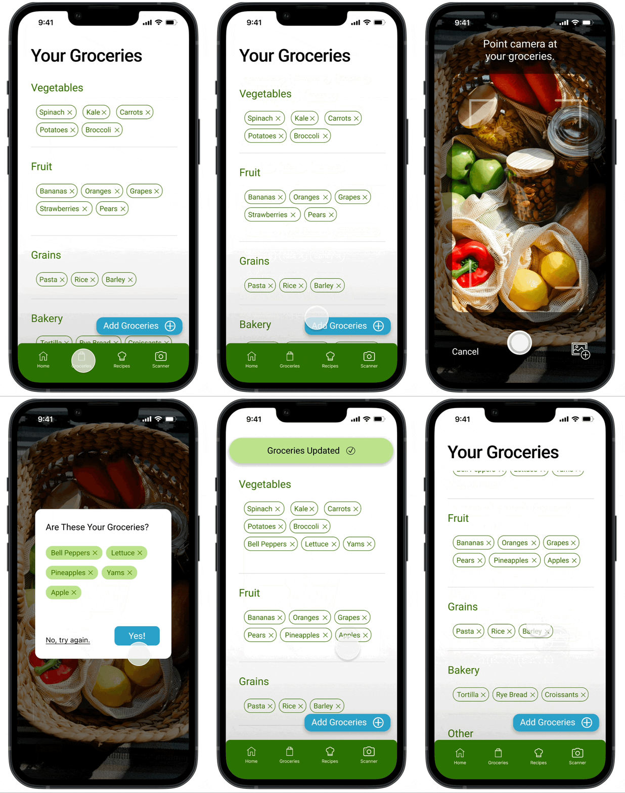
Groceries
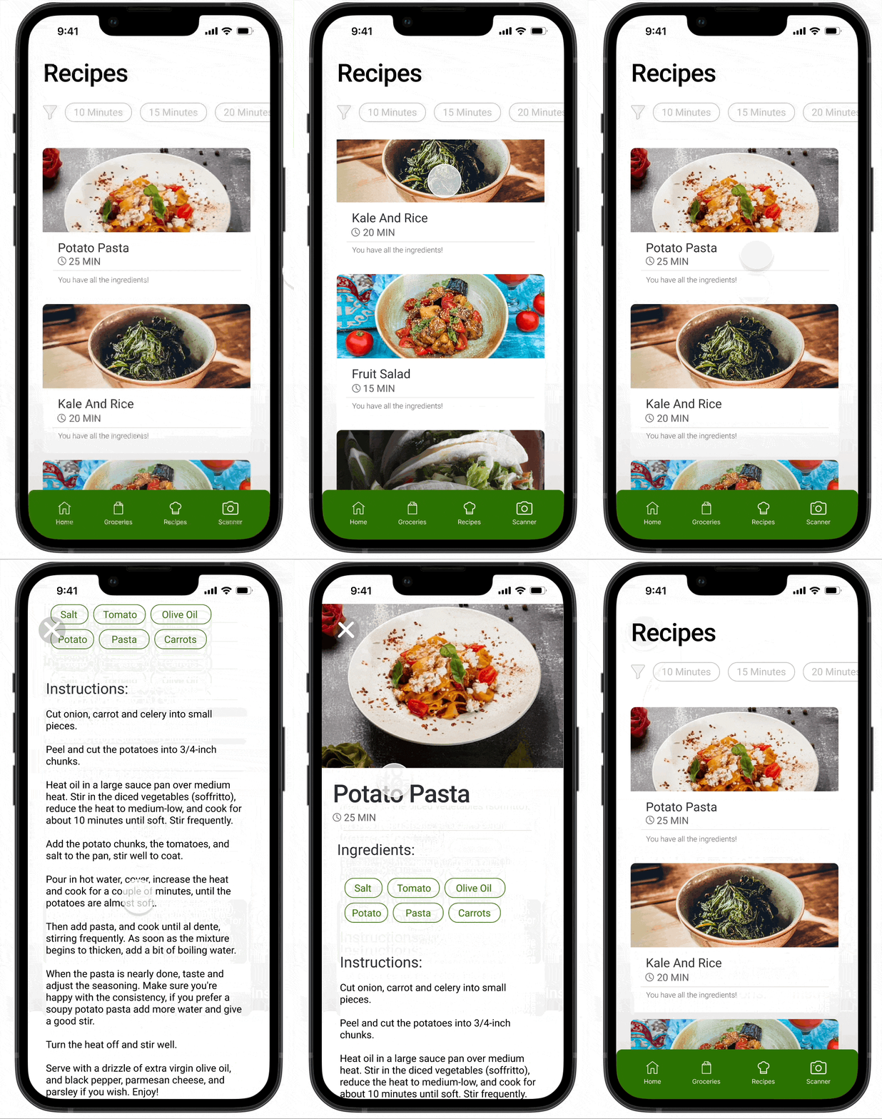
Recipes
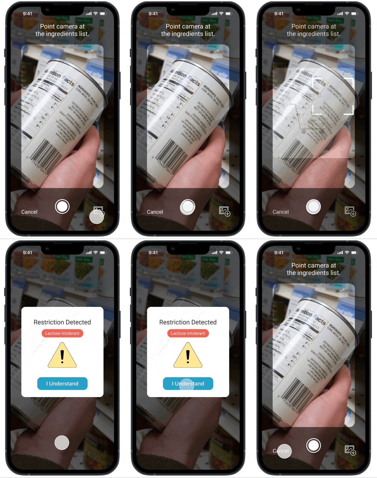
Allergen Scanner
Bonus
Visual design of logo and poster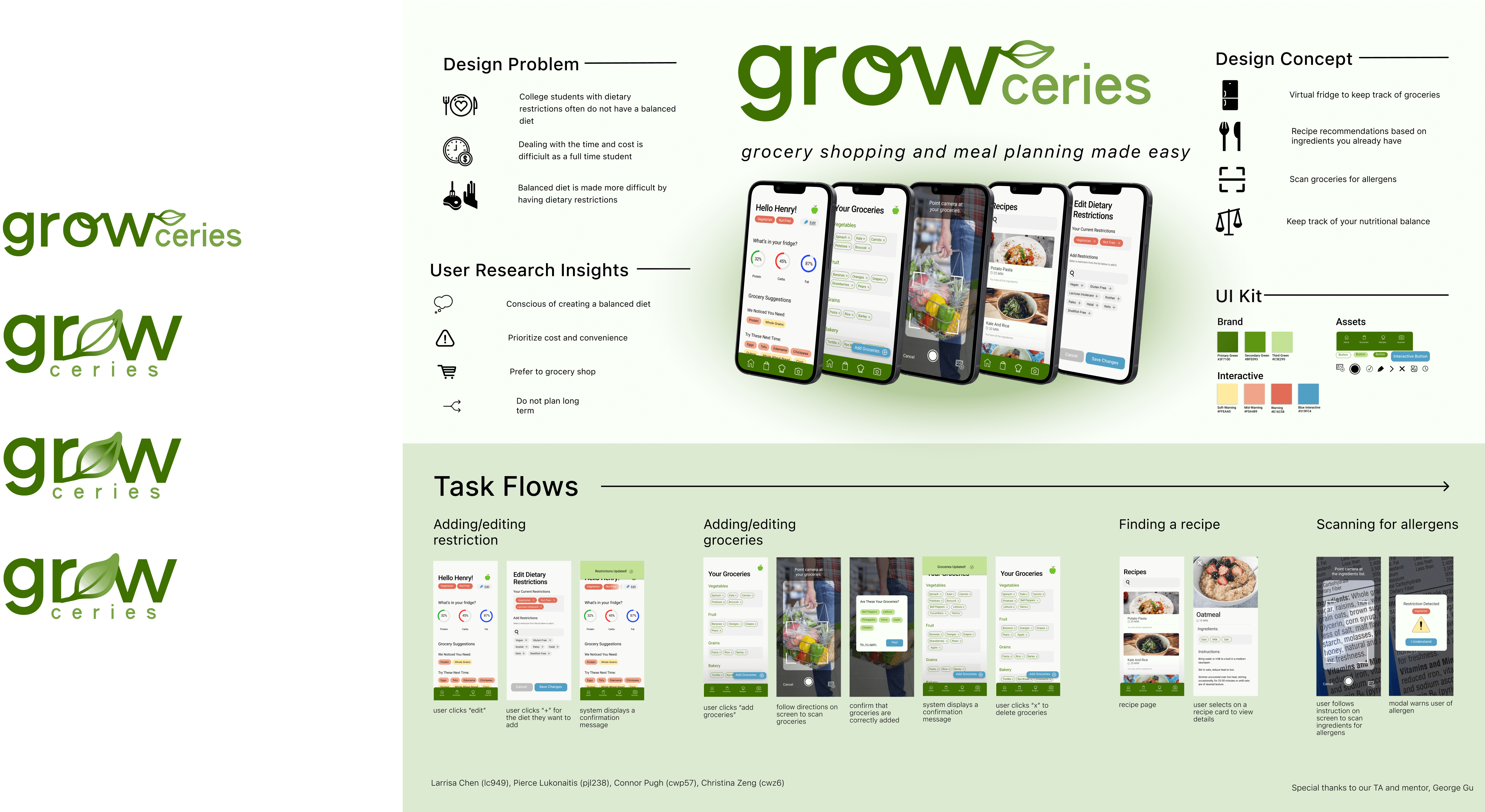
Takeaways
Future Improvements & ReflectionFIf I had more time I would:
- Consider integrating pricing within the grocery aspect
- Work more on visual design and branding
This design process taught me how to create deeply empathetic designs by prioritizing user needs to create an innovate solution. I really enjoyed delving to the root of the problem through user interviews to understand motivations and frustrations as well as testing to see how designs are perceived in real time.
