Carriage: Efficient Transit for Students with Disabilities
Product Designer | 16 Weeks
Overview
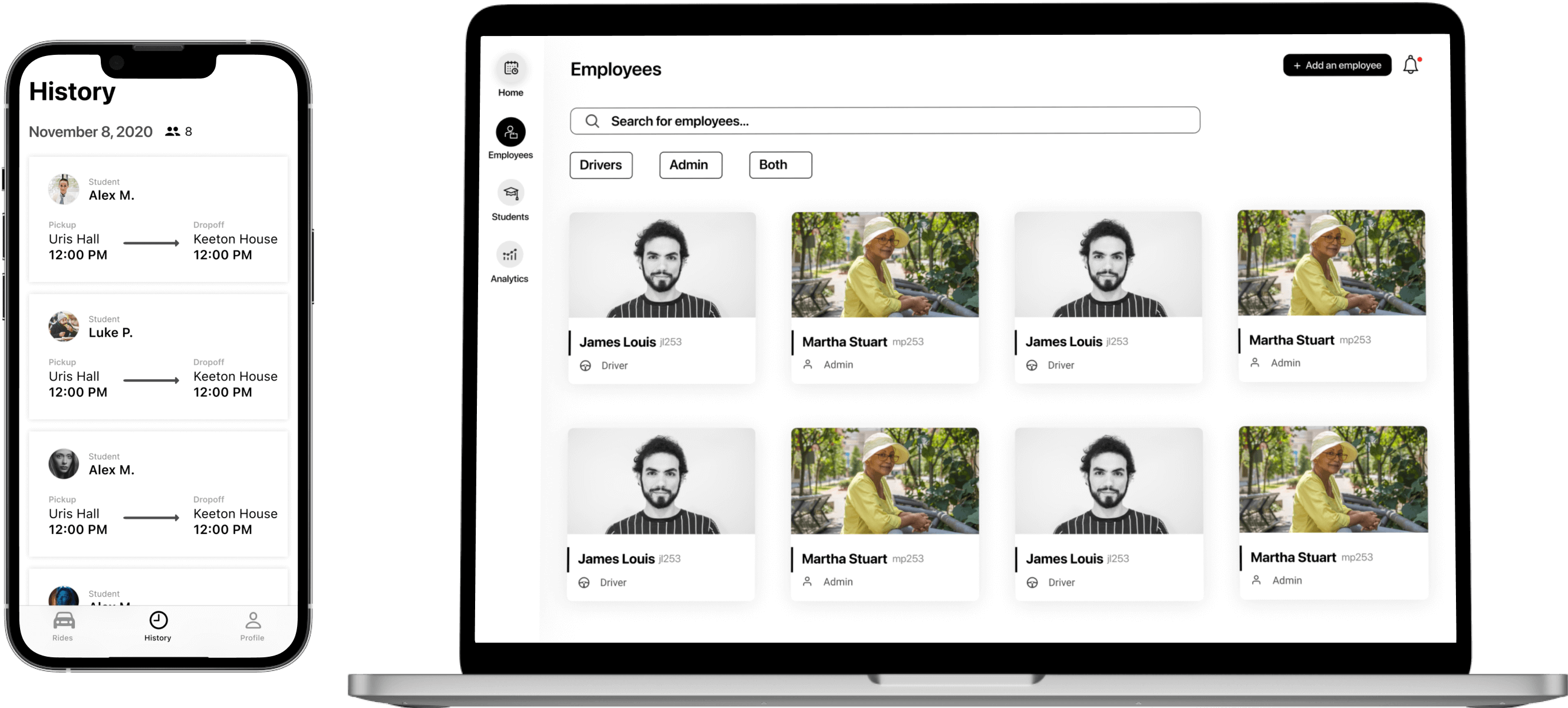
A product which works with Cornell’s CULift to provide transportation for students with disabilities
by improving task flows for ride scheduling, dispatching, and monitoring.
Admin/Driver Cards
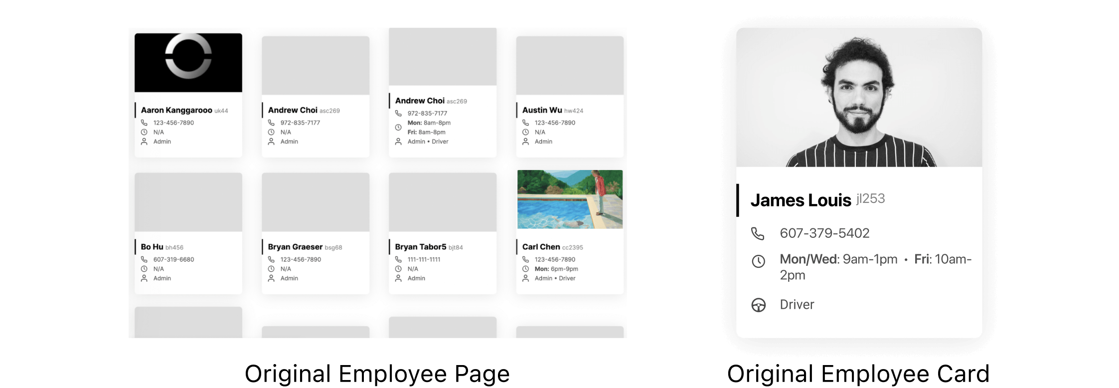
Standardizing cards for better visual understanding.Coming into this product, the original admin/driver cards included their schedules which led to an uneven display of employees. This led to confusion as to why some cards were bigger than others. Users wondered if bigger cards meant the employee was more important than another who was displayed with a smaller card.
I wanted to understand: How can I standardized admin and driver cards?
Iterations
In order to alleviate differently sized cards, I thought about different interactions which could be integrated.
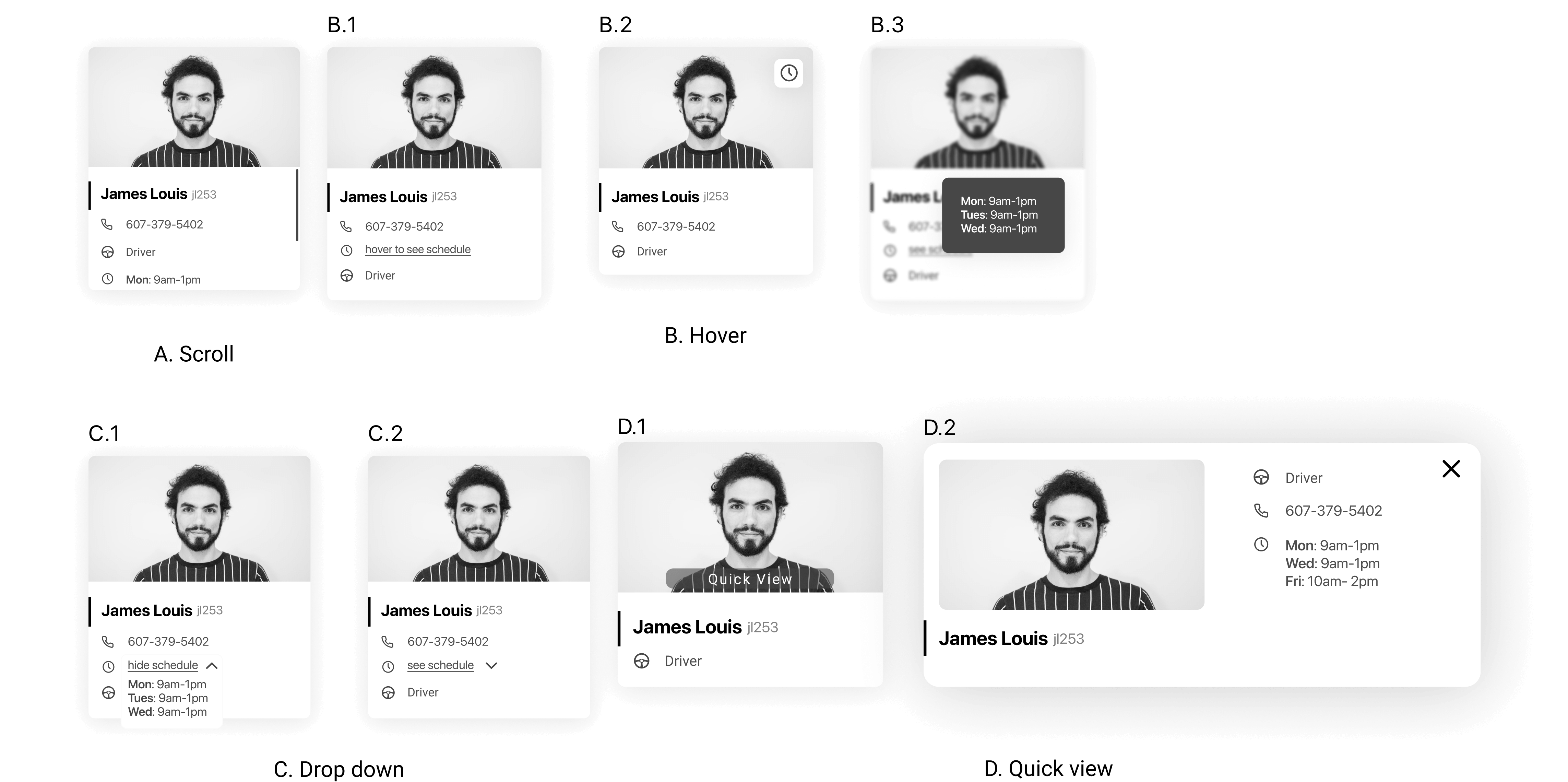
I decided that the inclusion of these interactive elements were not user-friendly as it forces too many actions within a small area. I then focused on including only the most important information necessary to be displayed on the card (name, role, and identifier code).
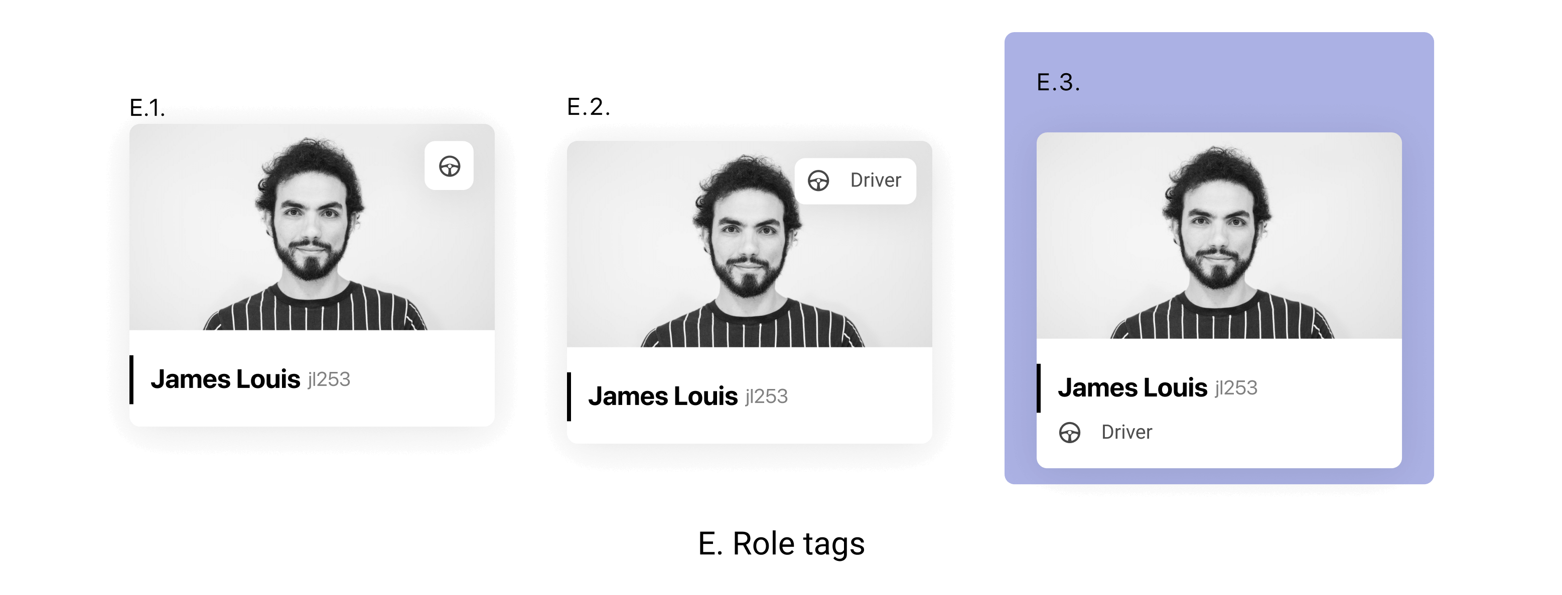 The final design (E.C.) includes the role directly on the card rather than in the form of
bubble tags with icons.
 I ultimately chose this because:
- The icons would yield accessibility issues.
- The information is clustered together within the same area.
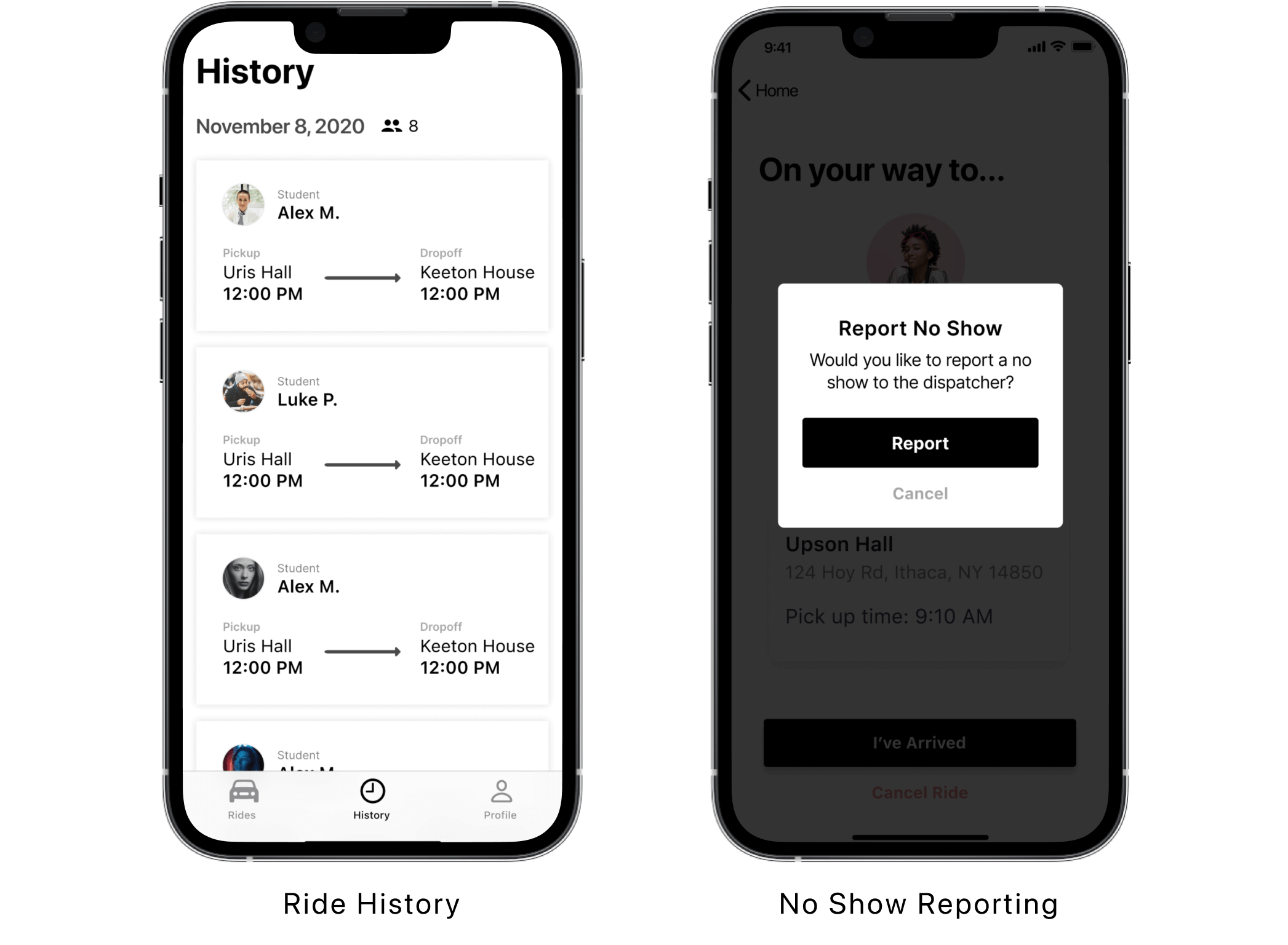
No Show Reporting
Error recovery for Carriage DriversDrivers must report students who do not show up for their rides, but sometimes this report can be incorrect. They could have mistakenly not seen the student, or the student could have been in a slightly different place than the driver expected.
I wanted to understand: If students are reported as a “no show” on accident, how can drivers fix this? In other words, I wanted to create an error recovery method for drivers.
Iterations
In order to alleviate differently sized cards, I thought about different interactions which could be integrated.

I explored iterations through dark and light indicators. Designs A, B, and C resembled buttons and would mislead users by creating a false affordance in that they are interactive which led me to favor explorations C and D.
Final Flows
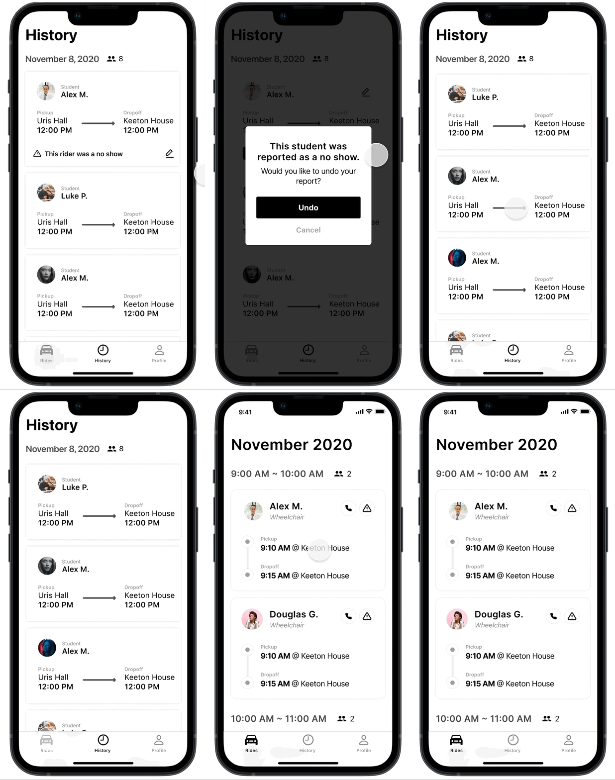
The final design (D) is one which does not look interactive and does not overemphasize the information. Ultimately, I chose this design because:
- The student is marked without the information tag overshadowing the rest of the card.
- It does not mislead the user by seeming interactive.
Takeaways
Learnings and ReflectionI learned:
- The importance of cross role communication.
- Understanding full scope of user needs.
This was my first time working as the only designer in a multi-role product team which encouraged me to keep channels open with other roles. I love working on a product that has such a profound community impact and am so grateful for the range of work this product has allowed me to explore.
