
Instagram Concept: Learning to Love the Explore Page
Product Designer | 10 Weeks
Overview
An explore page feature concept that allows the user to customize the content they see on their
explore page based.
The Problem
Instagram’s explore page got boring, so I redesigned it..Like many other Instagram users, I use Instagram as a form of entertainment. Whether I’m procrastinating assignments or chilling with friends, I like to scroll through to find posts and stories that interest me. However, I oftentimes find that the content I’m seeing is irrelevant or uninteresting to me.
I wanted to understand: How might Instagram content, particularly on the explore page, be more engaging for users?
User Research
What are pain points for users?Entering this case study, my original hypothesis was: If Instagram did not focus so much on the shopping feature, the app would be more engaging. My goal was to identify the problems people have with the organization of Instagram. Instead, I found that users had the biggest problem with engaging with the app.
Key Insights:
- Users believe that they are recommended irrelevant and uninteresting content.
- Users prioritize seeing the content of people they care about.
😨 ”I get shown random content I don’t even relate to.”
Brainstorming
Exploring engagementProblem spaces to explore:
- Uninteresting Content: How might we create more engaging home pages and explore pages for users?
- Prioritizing personal content: How might we give users more control over what they are shown?
Solution A: Pinning Accounts
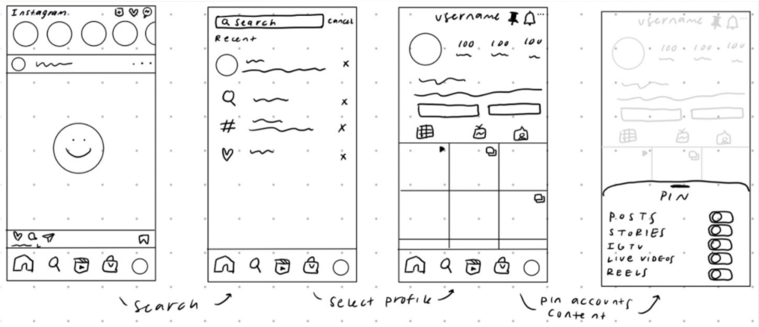
The user would be able to pin content from a user such as stories, posts, and messages.
✅ Allows users to find their close friends' content easier and quicker
❌ Decreases time spent on the app
❌ Users may pin too many accounts which counteracts the strengths
Solution B: Customizing the Explore Page

The user would be able to give input on the content that they are shown on the explore page.
✅ Increased interaction with explore page & on the app overall
❌ Decrease posting
❌ Decrease in interactions with other users
Choosing Solution B
Although both solutions have the same levels of feasibility and impact, I ultimately decided to move forward with the feature that allows users to customize the explore page because:
- Based on interviews, users had the least interest in the explore page. Adding a feature to this page would increase engagement with an aspect of the product they did not interact with much and increase time spent on the app.
- Users giving direct feedback to the algorithm will allow for them to feel like they have control over what they are seeing.
Entry Points
IterationsThere were two methods of entry that were considered.
- A separate page to add the interest tag (A, B, C)
- Add interest tag from post (D, E)
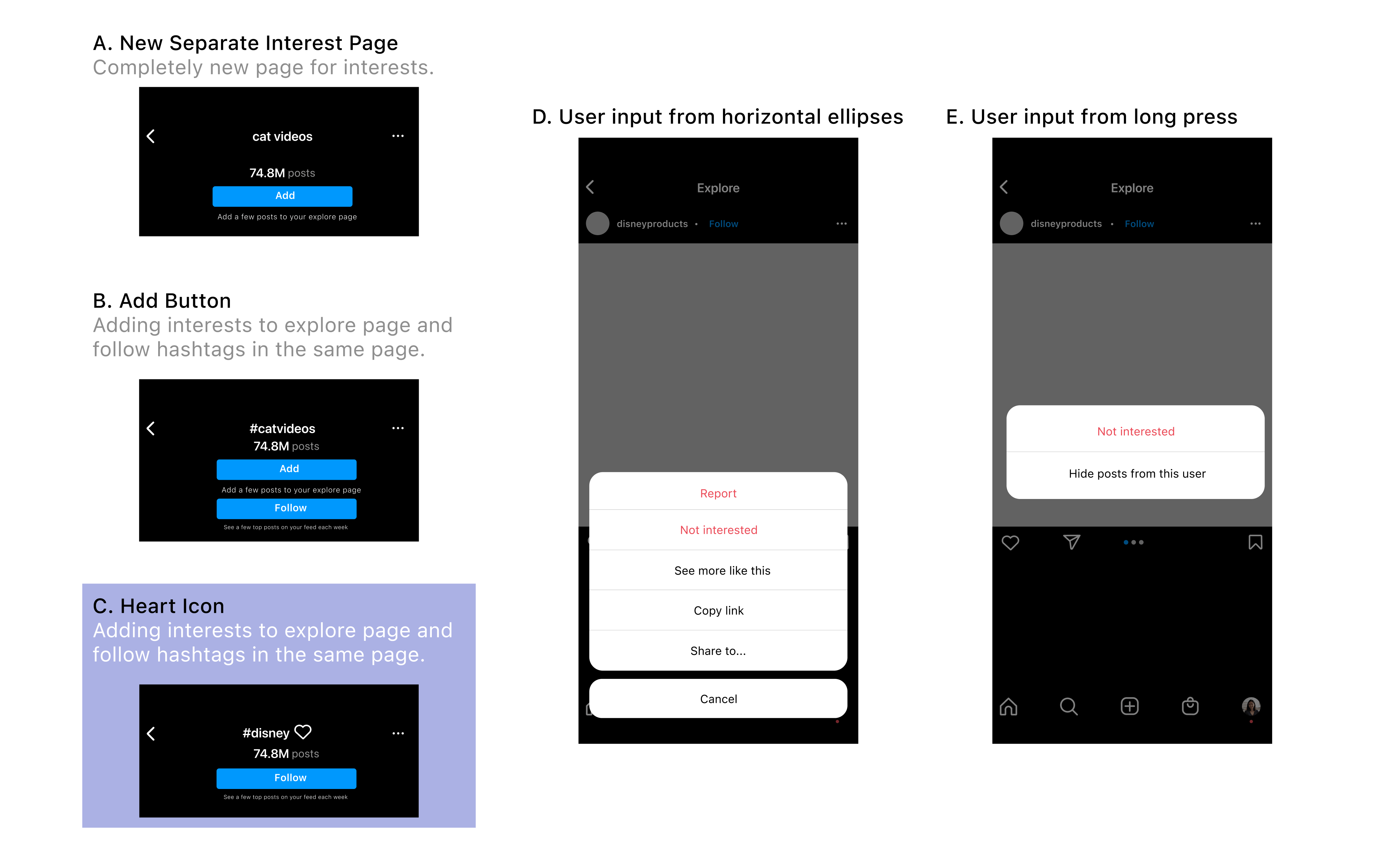
I decided to explore possibilities of creating the entry point at a separate page rather than accessing it from a certain post because:
- For the explorations D and E presented, we can see that the user would not be able to directly add a specific interest. Rather, the app’s algorithm would determine the specific topics of the post and then add those the the user’s tags.
- When asked about the “Not interested” feedback in the horizontal ellipses icon, many users that were interviewed were either unaware of the option or did not think it was an effective enough way to give feedback to the algorithm as there was explicit indication that they would not be shown these types of posts again.
Ultimately, I chose C as the final entry point because:
- In A, the engineering efforts would be too high as it would require a completely new page focused only on interest tags which confused users when tested.
- In B, the Add and Follow buttons were too similar which users reported they did not like as it was too visually cluttered..
- In C, the design combines the hashtag and interest tag pages but with the addition of a like button which adds the topic to the explore page. There is an obvious visible distinction between following a tag and adding the tag to the home page.
Feedback for Newly Added Tag
IterationsThere were three feedback methods that were considered.
- Utilizing the colorization of a new stories indicator (A)
- Adding a heart indicator (B)
- No indicator (C)

I decided to choose B as the new tag indicator because:
- For users, A was too similar to the new stories indicator and misled them to believe there would be a stories like interaction when pressing the tag.
- The users did not like the lack of indication as they wanted some sort of feedback.
- In B, the design is familiar to users, because it is the same icon used when liking posts and adding an interest tag in this case study. It was easy for users to recognize and did not mislead them.
Final Flows
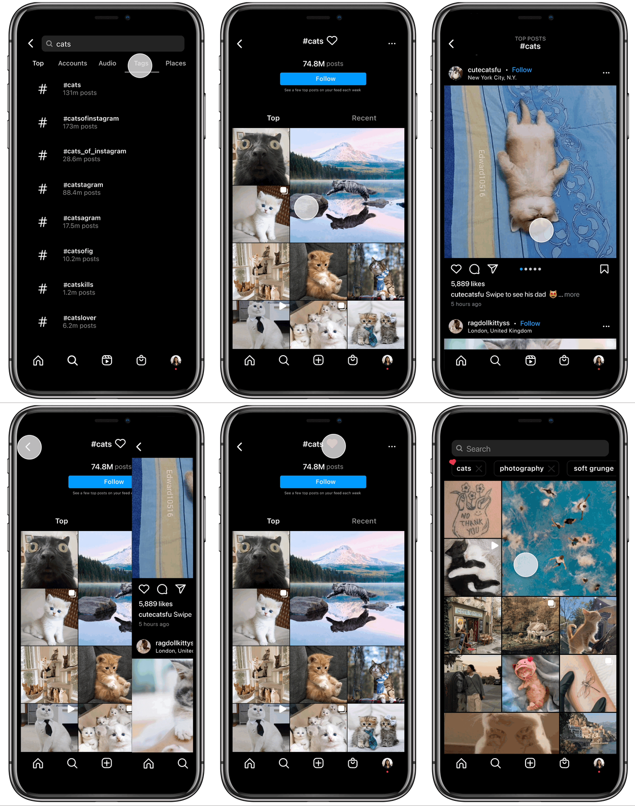
Adding an interest
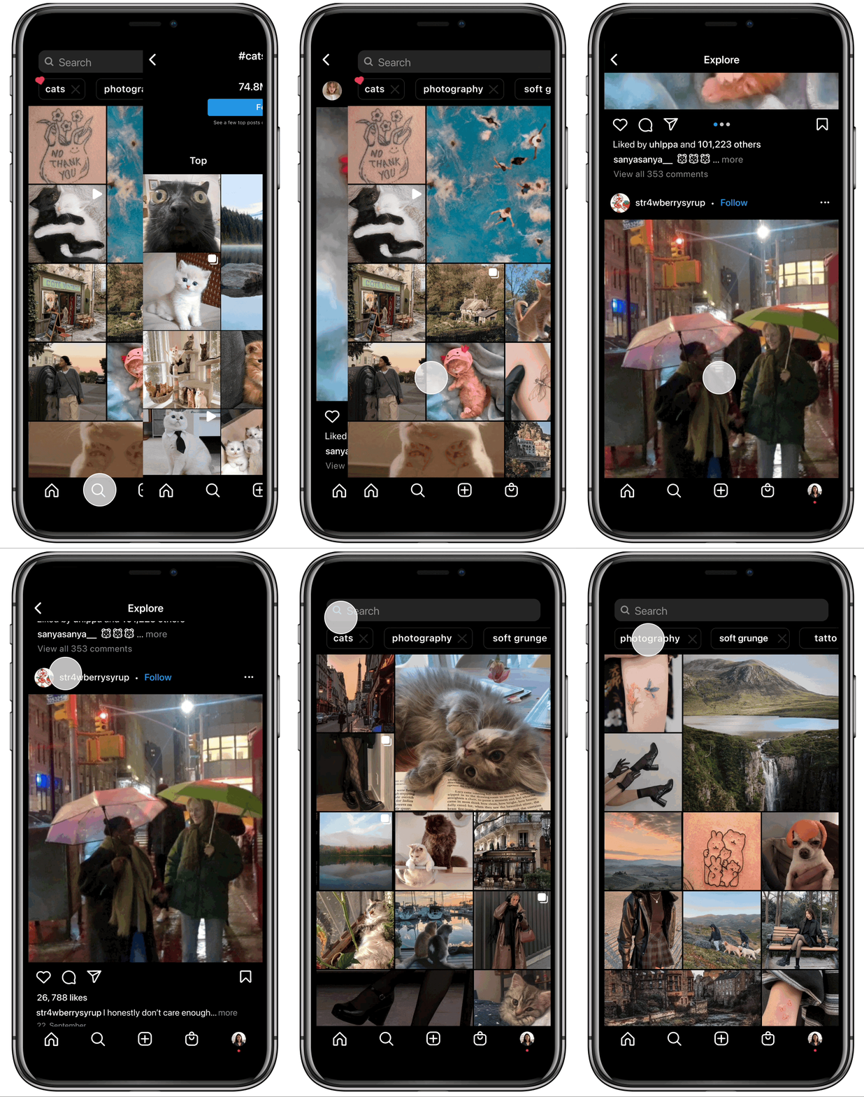
Deleting an interest
Takeaways
Learnings and ReflectionIf I had more time I would:
- Conduct more thorough user interviews and user testing
- Explore more entry points/other flows
